


Graphic Design 101: Week 7 - Psychology of Color
A brief intro to the world of Graphic Design with your Instructor Shannon McNamara!
Psychology of Color
Know what each color means before you choose that color!

Table of Contents
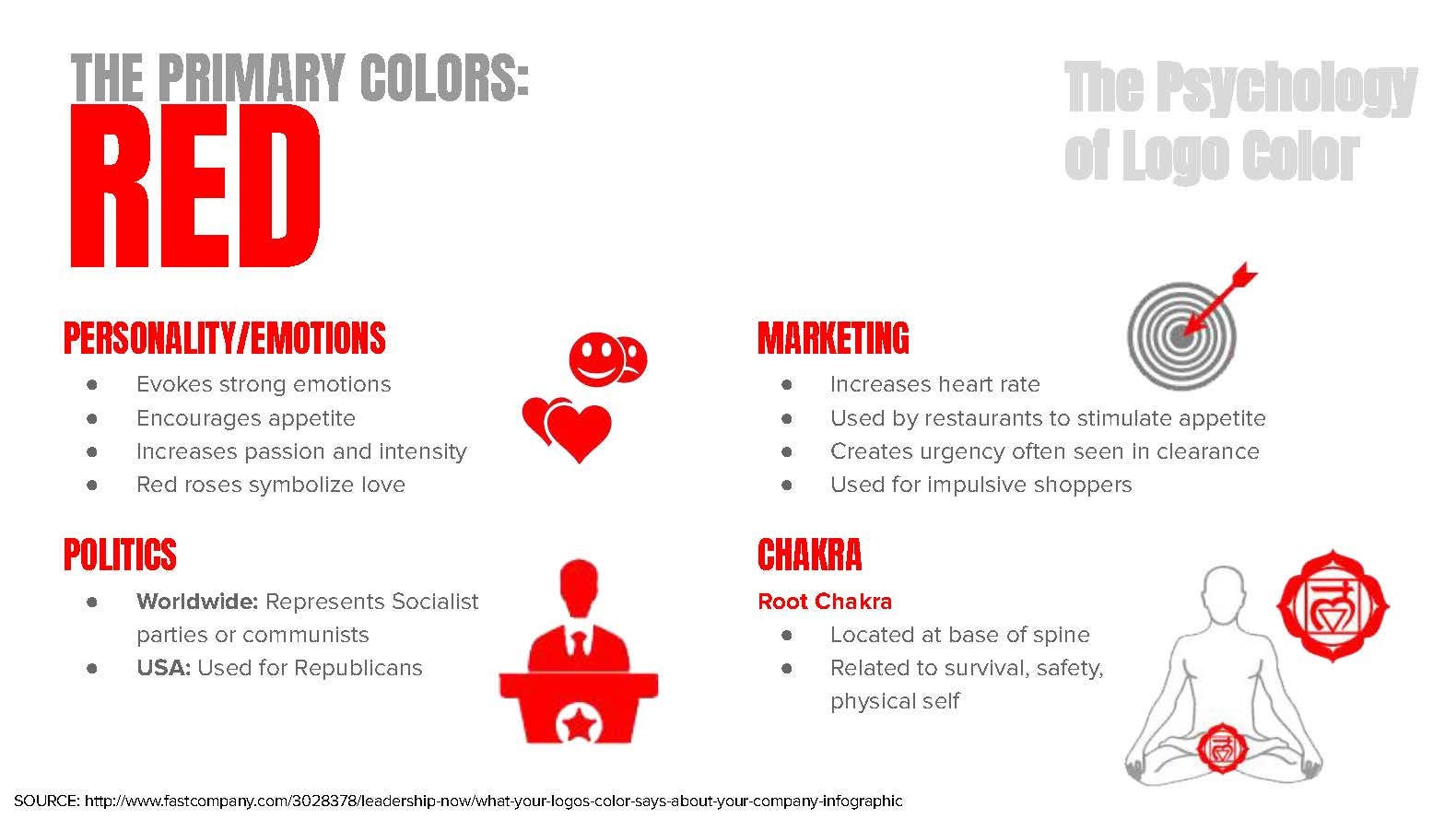
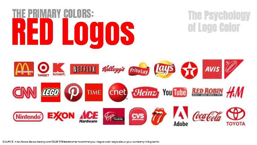
Red
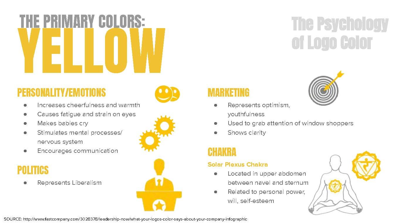
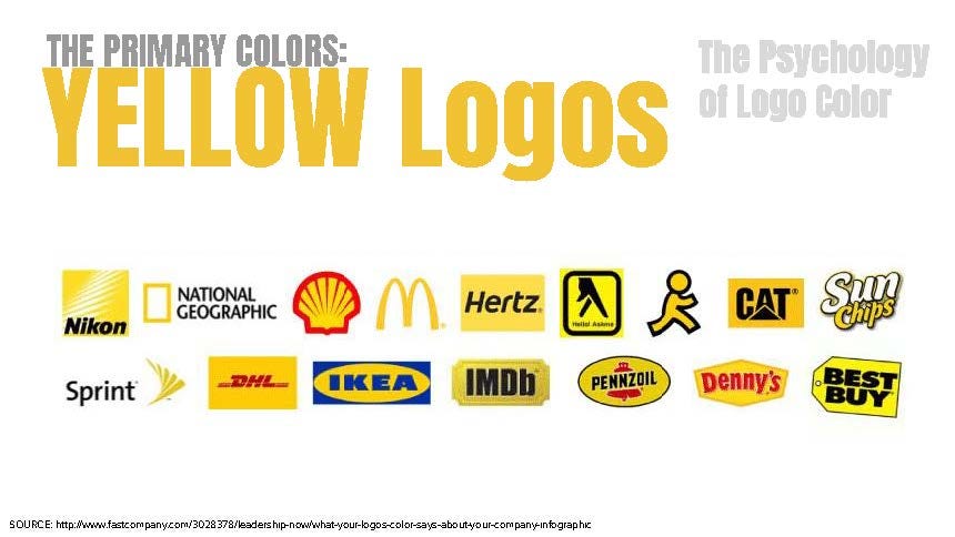
Yellow
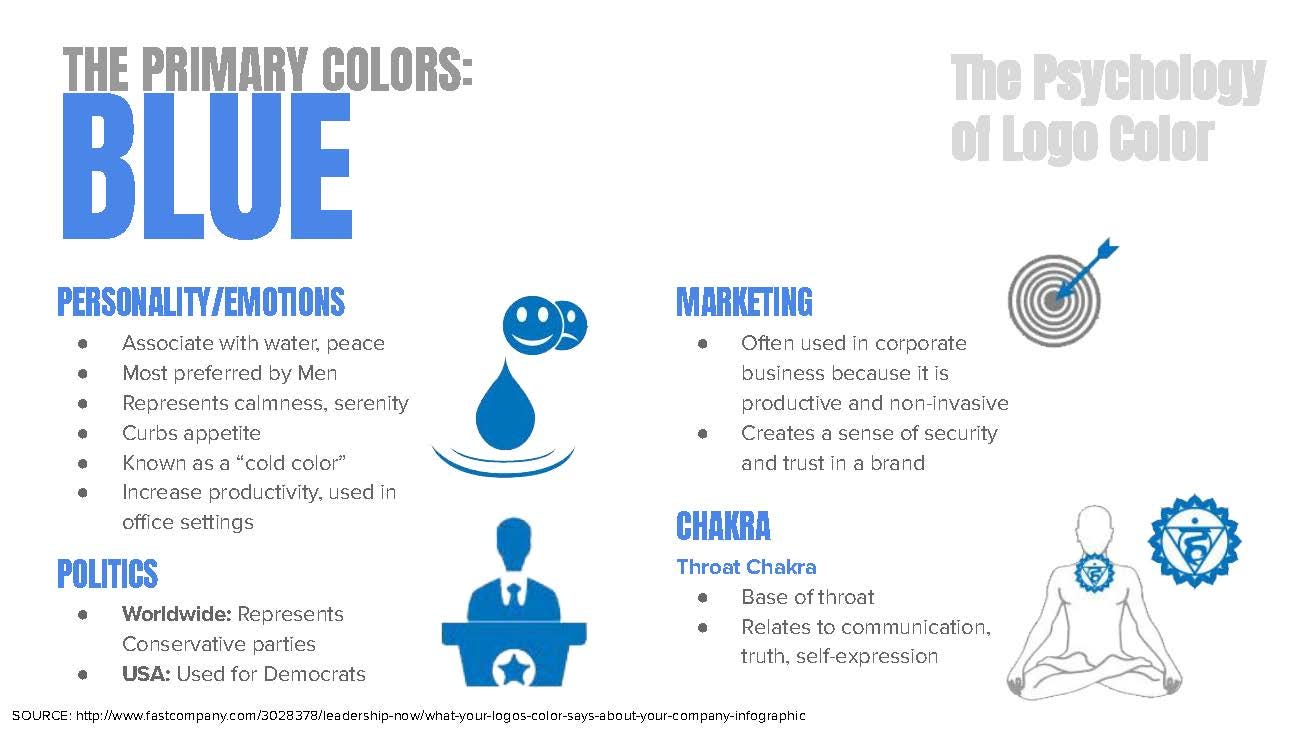
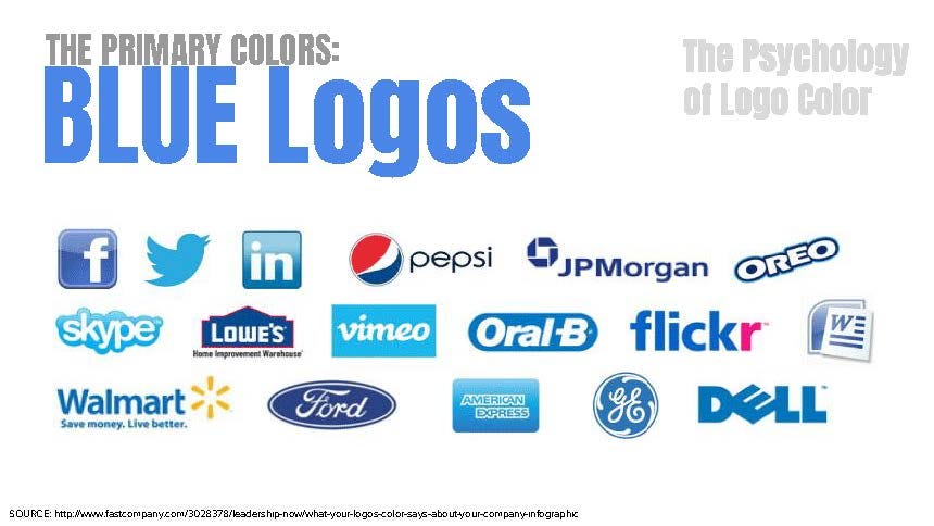
Blue
Please consider supporting me with a PayPal donation! Click below:
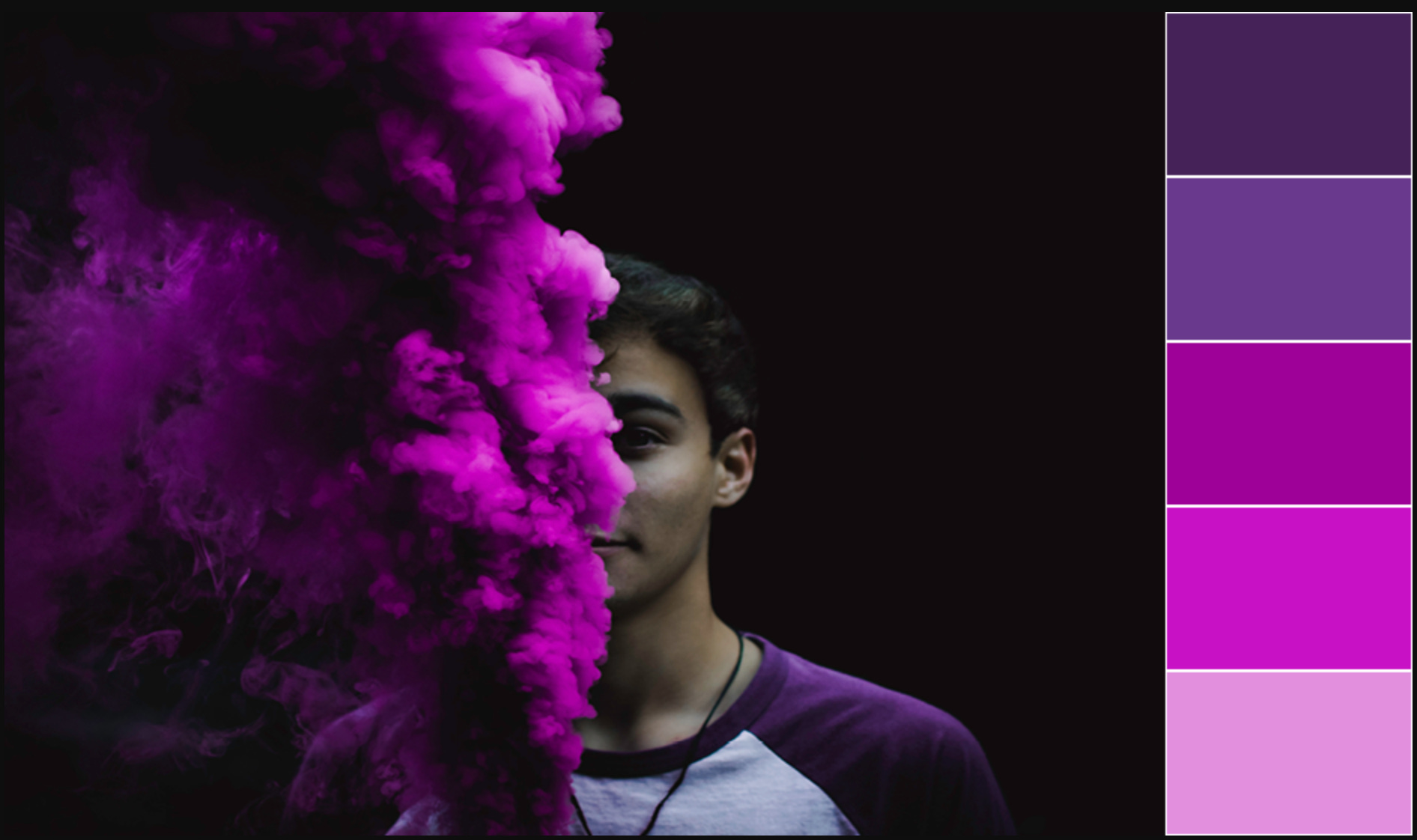
Pink

Pink color psychology
While pink has a long history of being perceived as girly and fluffy, this stereotype is gradually fading as more non-traditionally feminine brands make use of the color in their marketing efforts. In color psychology, pink is often associated with playfulness, fun and lightheartedness. Bright shades of pink like magenta or fuschia stand out, while being less alarming or threatening than the color red.
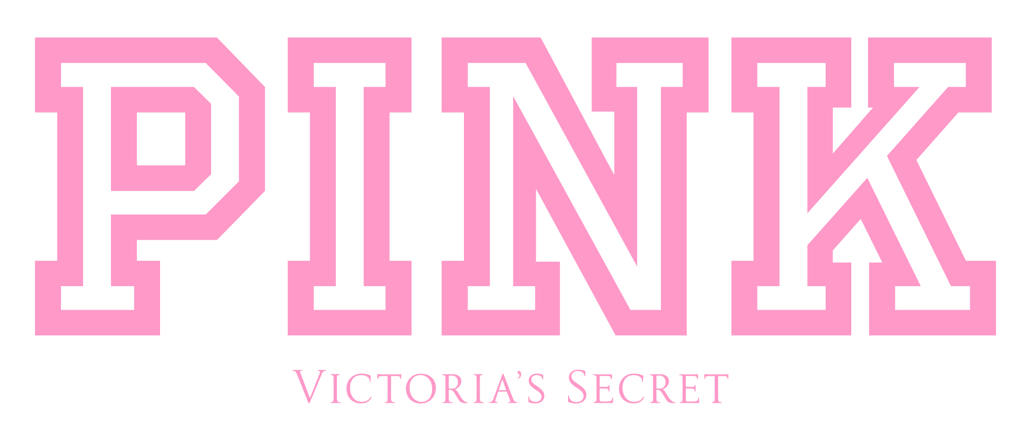
Perhaps the most well-known brand that uses pink in their visual identity is Barbie - a company strongly associated with all things girly. Many other businesses targeting women also opt for pink, such as make-up brand Benefit and Victoria’s Secret.
However, we can also spot the recent surge of pink in tech companies. For example, Invision’s logo is a vivid shade of pink, and the same color is used throughout their branding. The color has been newly embraced in tech for the feeling of energy, youth and excitement that it brings. The same goes for high tech insurance company Lemonade whose color scheme is made up of black, white and a striking shade of hot pink.

Purple
Purple color psychology
In color psychology, the color purple symbolizes luxury, royalty, nobility and wisdom. It’s also often associated with magic, mystery and the supernatural. This could be due to the fact that purple is a rare color to spot in nature, making it seem somewhat otherworldly.
Purple is quite an unusual color to find in marketing and isn’t used in many big companies. However, Cadbury has been using it in their logo since the beginning of the 20th century, even attempting to own the right to trademark its specific shade (Pantone 2685C). As purple represents luxury, the use of the color suggests that their products are of a high quality. Since Cadbury, additional chocolate brands have adopted purple too, for example Milka and Nestle (sort of, see below).


The Neutrals

Black color psychology
Black has many different color meanings. On the one hand, it is seen as timeless and classic. Think of a sophisticated suit, for example, or the classic “little black dress.” It can evoke elegance, sophistication, power and mystery. But on the other hand, it’s also linked to pessimistic feelings of anger, loneliness and depression, as well as mourning in Western culture.
Black has also caused a stir in the art world, as artist Anish Kapoor acquired exclusive rights to Vantablack - also known as the “blackest black in the world.” The pigment is supposedly so dark that it appears somewhat unreal, absorbing 99.96 percent of light. As a response, artist Stuart Semple developed his own dark pigment, coined Black 2.0.
In marketing, many brands opt for black as their logo’s color of choice. Iconic logos such as those of Nike, Gucci and Adidas were designed in black. As a clean choice that never goes out of style, the color can always be combined with other hues, making it fairly comfortable to work with.


White color psychology
White is widely seen as reflecting innocence, purity, goodness and rebirth. For many, it symbolizes a clean white canvas, or in other words, a fresh new beginning. It’s a neutral color that enables our eyes to rest, which is why it’s widely used in many fields, from interior design to web design (like the generous amount of white space around this blog post).
Additionally, white also gives off a pristine and hygienic feeling. But you should note that too much of it can create a sense of sterility (picture a dentist’s clinic for example), so unless you’re aiming for a very neutral look, it’s generally recommended to combine it with additional colors and possibly also textures.
In certain cultures, white relates to death and mourning. In Eastern Asia, white clothing is worn during mourning to symbolize rebirth and purity, whereas in Western culture, a bride typically wears a white dress on her wedding day.


Gray color psychology
Being on the scale between black and white, gray is perceived as neutral and balanced. Its lack of color makes it useful, as it can be implemented in cases where many colors are already being used, without causing disruption to the design. Gray can at other times add a sophisticated, modern feel to a well-balanced and contemporary design. Dark gray can also serve as a more toned-down version of black when looking for a less dramatic contrast.
However, gray also has some negative connotations in color psychology. It can appear dull or moody. In design, it’s generally recommended to combine gray with an additional color (be it white, beige or anything else) in order to bring the design to life.


Brown color psychology
While brown is not the most inspirational of colors, it can also be used effectively to create an earthy, natural tone. After all, it’s the color of wood, sand, mud and many other elements in nature. This can bring people to perceive brown as warm, comforting, safe and reliable. Light, natural shades of brown, like beige and cream, are often used in hygge interior decor to create an atmosphere that is clean and minimalistic, while also feeling warm and cozy.
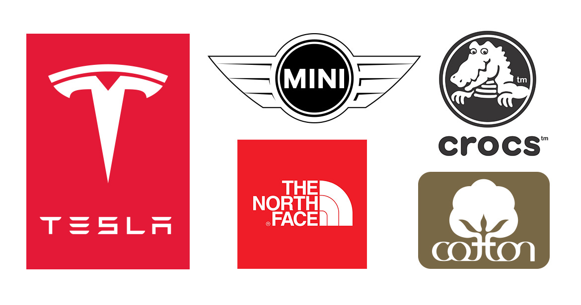
When it comes to marketing, brown can be used to craft a sense of trust and stability. Consider for example Louis Vuitton who use brown in their visual identity, giving their brand a classic, timeless air. Many chocolate brands like Godiva, M&M’s and Magnum also opt for brown - a natural choice for their product.


Font Resources:
Assignment Time!
Creating logos in Illustrator:
One black and white logo - saved as an .ai file, text to outlines
One color logo - saved as an .ai file, text to outlines
EXPORT COLOR logo as: .jpg, .png, and .pdf
Put the .png or .jpg of your logo in the chat!
How to Export from Illustrator:
STEPS:
Step 1: Click on the desktop or the finder icon and create a new folder on your desktop

Step 2: Name your folder "YourName_logos"

Step 3: In Illustrator, open your Black and White Logo from the cloud.
Step 4: File> Save As - save this logo to the folder you just created on your desktop

Step 5: Add color to your logo from the color pallet you have chosen at
Step 6: File > Save As "Your logo_color" in the folder on your desktop

Step 7: Export the .png, .jpg, and .pdf of the color logo only by using File > Export > Export As...

Choose: PNG (png) from the dropdown format box and click the blue EXPORT button

Choose: JPEG (jpg) from the dropdown format box and click the blue EXPORT button

Last: File > Save As - Choose PDF from the dropdown

